Little Debbie’s
First & Last’s basement amaro bar. Inspired by warm Italian hospitality and casual social nights.
SERVICES
brand identity design
(in partnership with Con Safos Illustrations)
Squarespace website design
menu design
copywriting

THE GOALS
Design a new brand for First & Last’s second basement bar that feels distinctly different from but complimentary to their existing brand.
Create a mini “website within a website” for the bar’s digital home — making it easy and clear for guests to understand the connection between the two spaces
Write a new brand story to clearly explain the purpose and goal of the space to new and returning guests
ABOUT THE PROJECT
I was thrilled when Ashley & Robb reached out to work with me for a second project — this time for their basement cocktail lounge within First & Last. Centered around amari (lower ABV Italian apertifs and degestifs), the goal of the space was to be a cozy spot to begin a night or end it. Think spritzes and a light bite before a concert downtown, or late night drinks with friends.
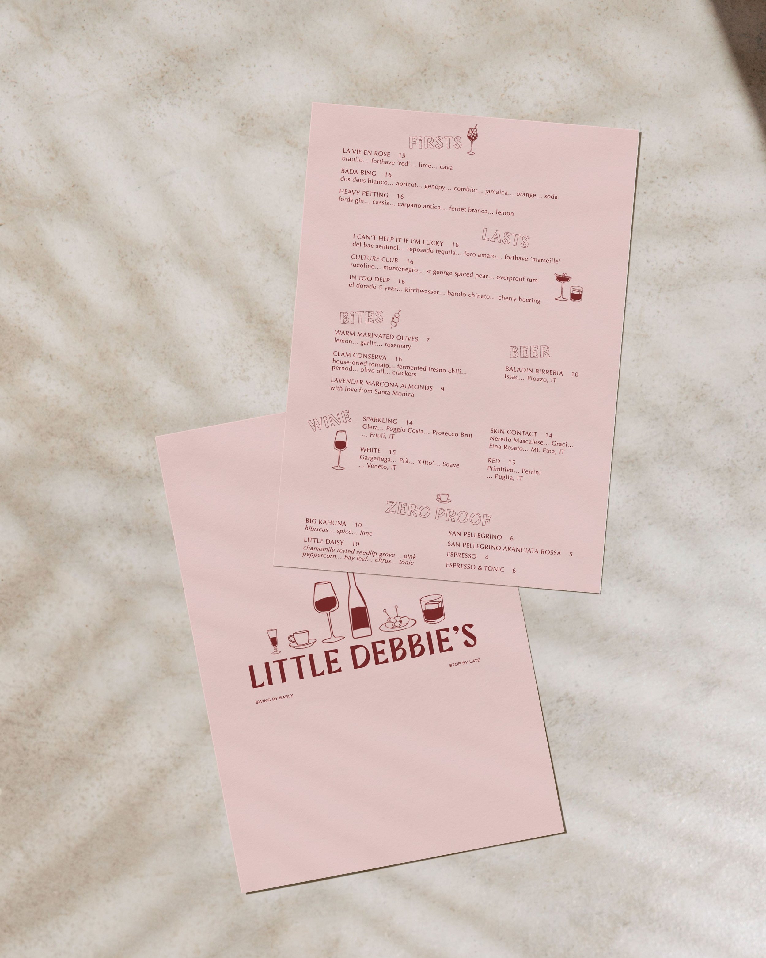
The result is a vivacious but relaxed brand that matches the spirt of First & Last, while still retaining its own unique perspective and purpose. I partnered with Jonathan of Con Safos to bring playful energy to the brand with hand-drawn illustrations of classic Italian bites and drinks that would be featured on the menu.

I was especially excited to play with type for this project, as there are so many directions and styles one can explore for Italian-inspired art styles. We settled on Buona for the primary typeface — the first commercial typeface from Outfit. They took inspiration from the chisel-cut, squared serifs of Roman capitals, the diagonal stress of Renaissance calligraphic type, and the high contrast modern work of Italian type designer Giambattista Bodoni.
Paired with Optima, a humanist sans-serif typeface, the resulting typography combination is quirky and expressive. Inspired by Italian typography through and through, it’s a modern and fresh take on a classic style. Playful and of-the-moment without being kitschy or overtly trendy.
Just like the physical space, we wanted the web presence for Little Debbie’s to be nested within First & Last. To accomplish this, I customized a single page on the existing site to act as a stand-alone landing page — complete with the full visual brand, a custom header navigation menu, and simplified footer.
What the client had to say
“ We felt from our very first call with you that you were a good listener, had a clear vision of how you work with your clients and understood what your work can do to be helpful to them. It was clear you worked with a larger purpose in mind - helping small businesses represent themselves well and authentically.
We can't thank you enough for your amazing work. It has helped our business immensely. ”
Section Styles portfolio-reviews

